Logotypes: Burger King
Global chain of hamburger fast food restaurants
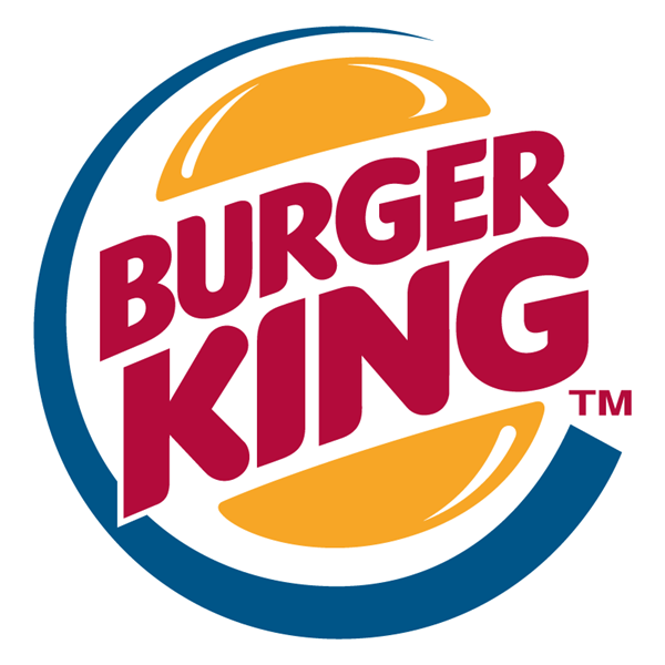
The Burger King logo illustrates a tempting and bubbly picture of a fast food chain, perfect for the fast food culture among the youth. The lively colors used are catchy enough to attract people.
Burger King logo comes as a tilted circle with bun halves on either side of the logo and the font emerging in the middle, together with a swirl underlining the complete design. It truly reflects the vibrant nature of the food chain.
The three colors used in the Burger King logo are red, yellow and blue. The beauty of the three primary colors forms an eye-catching motif just enough to attract all age groups to the ever green love for fast food.
© FamousLogos.org
Comments: 0
There are no comments yet, be the first to write a comment!